UESPWiki talk:Morrowind Map Design/Archive 1
| This is an archive of past UESPWiki talk:Morrowind Map Design discussions. Do not edit the contents of this page, except for maintenance such as updating links. |
Contents
Online Morrowind Map
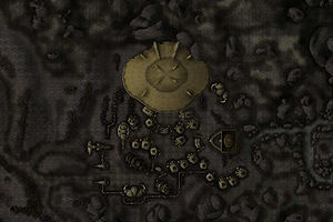
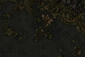
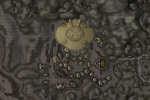
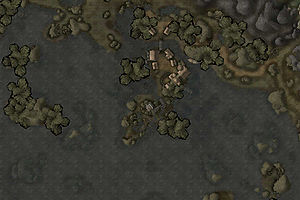
| Map Type | Ald-ruhn | Seyda Neen |
|---|---|---|
| Originals | ||
| Gamma of 1.5 | ||
| Gamma of 2.0 |
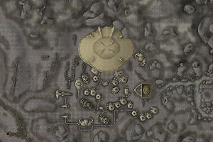
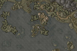
Before I start doing too much on this I'd like to get some feedback on what people think is right for the effects that need to be applied to the tiles. Above are two representative sections of map; one of Ald-ruhn and one of Seyda Neen at three different gamma levels; the original as exported from the game (1.0) then the same image at 1.5 and 2.0 gamma. Obviously, other values are possible and I can upload examples if anybody wants to see them, or you can see for yourself by taking the originals and applying a gamma in Photoshop, Paintshop Pto or any other paint package - the gamma effect isn't implementation-specific so it should always look the same.
Somebody's going to say that they prefer it with a gamma, contrast and colour resampling or something similar. An important consideration is that this all has to be done programatically - ie, I need to be able to write the filter and apply it to over 1500 images. Simple things like contrast may be possible but I'm not rewriting chunks of a paint package here.
My own thoughts are that the best value is going to be towards the 2.0 end - around 1.9 - and that nothing else will need doing. Please let me know your own opinions. –Rpeh•T•C•E• 07:01, 27 January 2008 (EST)
- I'd agree that a value somewhere between 1.5 and 2.0 would be best. I might be inclined to opt for a value somewhat lower than 1.9, but that's probably getting to the level where everyone has a different personal preference ;) With the gamma correction, the images look good! --NepheleTalk 02:00, 28 January 2008 (EST)
-
-
- Yes, the map images are looking good. My vote would go for a value between 1.8 and 1.9. Now I know I'm running a pretty dark contrast setting over here, but I think it can do no harm to have a bright map. These are no screenshots meant to display how the game looks. Everything will be visible, it will just look a bit ugly. Roads, for example, are not always very visible in Morrowind, but are important to distinguish as they are often an indicator for relief. --Timenn < talk > 14:25, 29 January 2008 (EST)
-
-
-
-
- My two monitors disagree as always - one likes the 2.0 and the other likes the 1.5. So if you average them to 1.75, it's not too far off from the 1.8 that others seem to be saying. That'll probably be about right. --TheRealLurlock Talk 14:58, 29 January 2008 (EST)
-
-
(outdent) Two points to follow up. First, the gamma I ended up using was 1.75 because it seemed to be the most-widely agreed upon figure. Second, the areas with brighter tiles aren't a bug in my code - the game exports the tiles like that. I'm working on fixing it but getting a seamless result is going to be tricky. –Rpeh•T•C•E• 03:20, 15 June 2008 (EDT)
Preliminary Feedback
Currently, the map is quite new and we know it still needs a fair amount of work. For the moment, the most useful feedback will be about general map design: overall features that are missing or need to be changed. We do not need to know about problems (broken wiki-link, wrong symbol, etc.) with individual map markers: once the site's cartographers have the ability to edit the map, those minor problems will be fixed. Thanks! --NepheleTalk 13:24, 16 June 2008 (EDT)
Questions:
- What do we want to include: DoorMarkers? TravelMarkers? Actual door locations? Silt Striders?
- Should we distinguish between these?
- Other items of interest: corpses? Merchant mudcrab? Quest NPCs outside of cities?
- Should we make it possible to do a query that shows all locations relevant to a given quest? For example, mwmap.shtml?quest=Recovering_Cloudcleaver would display markers for Hlormar, Sosia, and the Caldera Mages Guild.
- Quest location query would be very helpful. -Benould•T•C 13:47, 16 June 2008 (EDT)
- I've started to implement something like this. My thought is that the quest information can be added to the "SearchTags" field, for example add "Quest: Recovering Cloudcleaver" to that field for each of the three markers. Then it will show up if you do a search, and I can also set up a specific quest link like the one in the example. --NepheleTalk 14:44, 16 June 2008 (EDT)
Icons
![]() How's this for corpses? --TheRealLurlock Talk 13:54, 16 June 2008 (EDT)
How's this for corpses? --TheRealLurlock Talk 13:54, 16 June 2008 (EDT)
- You're taking my job... Otherwise, I think it could be a bit darker. Also, what I've noticed in Oblivion icons was that there was a brighter outline around the image depicted. But hey, I'm becoming OCD about these. Vesna 13:59, 16 June 2008 (EDT)
- I agree it could use more contrast to be more similar to the existing icons. Also, FYI, uploading any icons to the wiki only works as a temporary step. The icons used by the map are not hosted by the wiki. I can take this icon and copy it over to the map's set of icons, but I think it would then be more appropriate to delete the wiki version of the image. Mainly because it will lead to confusion: other editors might try to upload a replacement icon here and then be confused about why the icon doesn't appear on the map. --NepheleTalk 14:38, 16 June 2008 (EDT)
- Yeah, I just threw it together because I didn't think that circle with a line through it was appropriate for this. I admit I could've spent a bit more time on it. As for uploading it, I didn't know where else to put it, so feel free to move it where it's supposed to go, since only you and Daveh are able to do that anyhow. Sorry Vesna for stepping on your toes there, I'll just let you take care of the rest then. --TheRealLurlock Talk 15:32, 16 June 2008 (EDT)
- Could we swap the Daedric shrine icon (iconDaedric.gif) with the unused Daedric letter icon (Oblivion.gif)? Seems like a better fit and we can then use this Statue icon for Landmarks, instead of the Mountains icon. --Benould•T•C 00:25, 24 June 2008 (EDT)
- It's easy enough to do. I'm just worried about such a swap starting to introduce some unnecessary confusion. Players who are used to the in-game Oblivion map (or our online Oblivion map) might find it distracting to have the same icon mean two fairly different things in the two different contexts. Or that's my thought, at least. --NepheleTalk 00:59, 24 June 2008 (EDT)
- Could we swap the Daedric shrine icon (iconDaedric.gif) with the unused Daedric letter icon (Oblivion.gif)? Seems like a better fit and we can then use this Statue icon for Landmarks, instead of the Mountains icon. --Benould•T•C 00:25, 24 June 2008 (EDT)
- Yeah, I just threw it together because I didn't think that circle with a line through it was appropriate for this. I admit I could've spent a bit more time on it. As for uploading it, I didn't know where else to put it, so feel free to move it where it's supposed to go, since only you and Daveh are able to do that anyhow. Sorry Vesna for stepping on your toes there, I'll just let you take care of the rest then. --TheRealLurlock Talk 15:32, 16 June 2008 (EDT)
- I agree it could use more contrast to be more similar to the existing icons. Also, FYI, uploading any icons to the wiki only works as a temporary step. The icons used by the map are not hosted by the wiki. I can take this icon and copy it over to the map's set of icons, but I think it would then be more appropriate to delete the wiki version of the image. Mainly because it will lead to confusion: other editors might try to upload a replacement icon here and then be confused about why the icon doesn't appear on the map. --NepheleTalk 14:38, 16 June 2008 (EDT)
Search tags
I started adding search tags to markers, so that when you type vampire, berne, slave, propylon etc. all related locations will be listed. Works as well for traders, Smith, Clothiers and the like. Please add any other keywords that might be helpful.
some other ideas:
- Sixth House bases
- MQ for Main Quest locations
- Artifact locations
That's it so far, --Benould•T•C 22:03, 18 June 2008 (EDT)
Categories
So... we could use the inn icon from Oblivion to represent tavern. I believe monument should be fused with landmark. As for the guilds... do we want a separate icon for each type of guild hall (mages, fighters) or one universal icon? Vesna 22:19, 18 June 2008 (EDT)
- The OB Inn icon sounds good, as does fusing Monument and Landmark. I think one icon for the guilds should suffice, so we don't have too many categories. --Benould•T•C 23:30, 18 June 2008 (EDT)
- OK, I've added Store, Tavern, Temple, and Guild to the list.
- I set up Monument as an extra category because of the Bloodmoon places listed under Monuments. If there really is no difference between those and other landmarks, then I think the Bloodmoon places pages should be changed to merge the two categories, too.
- I'd been using "Settlement" for individual buildings that are located on their own in the middle of nowhere (Dren Plantation, Arvel Manor, Llovyn's Farmhouse, etc.) versus "House" for houses that are part of larger towns or cities. One reason for the distinction (at least in the initial setup phase) was because the default zoom levels were set differently in the two cases. --NepheleTalk 01:07, 23 June 2008 (EDT)
Updates
Two significant changes have been made to the map today:
- There is now a zoom17 level available. In other words, it's possible to zoom in one step closer to the map than previously possible.
- The positions of marker labels can now be changed (either globally or individually).
Both of these changes should make it possible to reduce the overlap between labels in the cities. To see the changes, you'll probably have to do a hard refresh of the map in your browser (e.g., Ctrl+F5).
One question that then needs to be answered is:
- Where do we want map marker labels to be positioned by default? The current setting is "Top Right", i.e., the label is positioned above and to the right of the map marker icon. I'm inclined to think that a better default setting would be "Top Center" (horizontally centered, vertically above the icon) or "Middle Right" (vertically centered, horizontally to the right of the icon). It would probably be good to decide on the default position before we start trying to optimize individual labels. --NepheleTalk 00:55, 23 June 2008 (EDT)
- I'd vote for "Top Center". "Middle Right" would be good if you could make some of them "Middle Right" and some "Middle Left", and allow the editors to choose which gets used (for example, choosing one or the other based on which side of the street a house is on in order to avoid overlap), but if they all have to be the same, I'd go with "Top Center", (or maybe "Bottom Center"). None of the others make much sense to me. --TheRealLurlock Talk 02:28, 23 June 2008 (EDT)
- I'd go for "Middle Right" as the default. Another question: do we want to change this on the other maps too? –Rpeh•T•C•E• 03:13, 23 June 2008 (EDT)
- Once I move the other maps over to the new location on the server (so all the maps are sharing the new code) then customized label locations will become available for those maps, along with a few other updates. Whatever we settle on as the default label location here will be adopted as the new default location on those maps, too. Hopefully over the next week I'll be able to get most of the migration done.
- Oh, also, for those who are curious: the full list of (currently implemented) possible label locations are: Top Right, Top Center, Top Left, Middle Left, Bottom Left, Bottom Center, Bottom Right, Middle Right, and Center. (I doubt we'll ever use Center, but it was the easiest to implement). --NepheleTalk 03:39, 23 June 2008 (EDT)
- Wouldn't "Center" put the text right on top of the icon and make it hard to read? I can't imagine why anyone would want to do that. But yeah, if it will be possible to customize it and pick and choose per location, I'd agree with "Middle Right" as default, and switch some over to "Middle Left" where necessary. --TheRealLurlock Talk 10:10, 23 June 2008 (EDT)
- Well, I suggested Top-Center as the one I am used to from printed maps, based on the principle of quick recognition. However, I just did some research on online maps, and they are generally all over the place, so to speak, with city names in the continental US having middle-right and middle-left orientations, and others using whatever orientation they feel like. The only issue with center-right I see are the tombs, i.e. Drethan Ancestral Tomb and named shops, i.e. Nalcarya of White Haven: Fine Alchemist, for the sheer length of the names. I suppose they can all be tweaked, so I am fine with middle-right or top-center default. --Benould•T•C 12:07, 23 June 2008 (EDT)
- Wouldn't "Center" put the text right on top of the icon and make it hard to read? I can't imagine why anyone would want to do that. But yeah, if it will be possible to customize it and pick and choose per location, I'd agree with "Middle Right" as default, and switch some over to "Middle Left" where necessary. --TheRealLurlock Talk 10:10, 23 June 2008 (EDT)
- I'd go for "Middle Right" as the default. Another question: do we want to change this on the other maps too? –Rpeh•T•C•E• 03:13, 23 June 2008 (EDT)
-
-
-
-
-
- OK, "Middle Right" it is. I've changed all the existing marker labels over to Middle Right. Apologies for rushing the decision, but until that decision was made it wasn't really possible to start tweaking any labels that need to be moved to a non-default position to fix overlap issues. Now anyone (or at least any cartographers!) who notices an overlapping label can tweak its position. As a general guideline, I'd suggest trying to only customize positioning for labels that appear at high resolution (zoom16 or zoom17, for example). That will help keep positioning consistent on low resolution maps, and also limits problems from tweaking to make the label look good at zoom15... but in the process making it look worse at zoom17. --NepheleTalk 15:05, 23 June 2008 (EDT)
-
-
-
-
What about the mudcrab merchant? — Unsigned comment by 99.241.48.204 (talk)
Map updates, transport labels adjusted
- Disabled markers
- Apronia Alfena, Supply Ship instead
- Thormoor Gray-Wave (transport) @ Thormoor's Watch: diasabled, landmark is marked instead
- Changed markers, not a transport
- Elberoth, corpse, disabled, Supply Ship is used, quest tags
- Captain Roberto Jodoin, changed to Patchwork Airship, Landmark, marked approx
- Baro Egnatius, NPC quest target
- Thormoor Gray-Wave (in Thirsk), NPC, quest target, could disable
- Bugs in Map, do not show, only in search, parameters correct
- Thormoor's Watch
- Mortrag Glacier
- Supply Ship
All boat transport and silt striders are now marked as "<type>, <Town Name>", ie. Silt Strider, Suran. Label positions are adjusted for overlap. Cheers, Benould•T•C 14:00, 4 July 2008 (EDT)
- Bug with Thormoor's Watch, Mortrag Glacier, and Supply Ship has been fixed. --NepheleTalk 14:45, 4 July 2008 (EDT)
NPC on map updated
- Added quest keywords for all the NPCs from the last batch.
- At this point, |mapname= links can be added to the NPC and affected Quest pages. Is this something a bot can do?
- Some marker names were shortened for clarity of the display, ie. St. Delyn, Canal North-One -> Canal North-One.
- Vivec Cantons labels adjusted for overlap and wiki page-links added or corrected. --Benould•T•C 16:40, 5 July 2008 (EDT)
What Else to Add?
NPCs
- (First part of discussion moved here from User talk:Rpeh/Sandbox/8) --NepheleTalk 20:16, 30 June 2008 (EDT)
One thing that might be worth putting on the map is locations where a party of hostile NPCs will attack you. So while each individual NPC is not notable enough to put their location on the map, it might be worth noting that an ambush is waiting in this location. We'd need to come up with a new symbol, of course, and analyze this data to put ambush groups together, but I don't think this would be terribly difficult. (Just making the table sortable, and then clicking the X and then Y column would group the nearby ones, I think, and then you could pick them out that way.) --TheRealLurlock Talk 09:37, 30 June 2008 (EDT)
- By the same extension, you'd also want to add fixed creature encounters, such as the annoying Kagouti. Would this not make the map rather cluttered? Mind you, one creature encounter that probably should be added to the map is the double-sized creature in the Grazelands. --Gaebrial 09:59, 30 June 2008 (EDT)
-
- I can think of an image, we could use a crossed swords or a shield image for ambushes, I know I saw one lying around somewhere on this site, or maybe we could modify the Oblivion:Strength Image.-Puddle Talk•Contribs. 10:02, 30 June 2008 (EDT)
- How about this image? As far as I can tell from the terms of use, it's ok to use. --Gaebrial 10:12, 30 June 2008 (EDT)
-
I think with ambushes and creature encounters we're starting to cross the line from what's more useful to what's less useful. I think the map's primary purpose should be to help readers find things that they're looking for. So places/people/creatures that you have to find as part of a quest are obvious examples of markers that need to be added. But beyond that I think we need to establish some general criteria for what we all consider to be useful. Otherwise we run the risk of bloating the map with too many markers. The more markers there are, the longer it takes to load up the map. The markers also start to add clutter to the map: they obscure the underlying terrain, and if a reader doesn't find the marker useful then it's just a distraction.
I personally think that transportation-related people are useful on the map. Or at least, that a consistent set of markers indicating where you go for transportation services should be added: either markers for the people, or markers for the Silt Striders, boats, etc. (but not both). I'd prefer marking the people, since their location is specifically where you need to go in order to purchase transportation. Although perhaps the marker label should not be "Navam Veran" (for example), but "Silt Strider, Ald'ruhn", with the NPC name only appearing in the Search Tags; a new "transportation" category might also be useful. Finally, I'd suggest adding "Transportation" to the Search Tags. Some of my reasons for thinking transporation markers would be useful include:
- The locations of the transportation services are not always obvious. If you enter the town by foot through the gate where the Silt Strider is found, you'll probably notice it. But there are many other ways to enter a town (other gates, intervention, etc.) in which case it's possible to have no idea.
- The transportation services are not in the middle of towns. That means that adding additional markers will not cause major problems of overlap with all the other markers already in town. It also means that the transportation services are somewhat different than other NPCs standing in town. You can't just say, for example, "standing in front of the Mages Guild" -- nor can you just use a link pointing to the Mages Guild to show where the person is found.
- Having the map markers will allow useful links to be added to the wiki, and will allow useful searches to be done on the map. The Silt Strider page could have a link to the map using a search on "Silt Strider" which would immediately show readers where all of the Silt Striders are located. A search on "Transportation" could be used to show where all transportation services are found.
I don't think that ambushes and creature encounters add the same usefulness. Unless the ambush/creature is the target of a quest, I don't think readers are going to want to search out and find other encounters. The only usefulness I could see is that if you knew ahead of time the ambush was there, you might avoid the area. But that's a very different process: you'd only find out about the ambush if you happened to be constantly surveying your planned route along the map, using the map's maximum resolution. It would also only be useful if you're expecting the map to show you dangerous locations, which isn't the case if there are only a handful of such markers on the map. It's basically impossible to start trying to tag every place where you might encounter something hostile: imagine what the map would look like if we added every Cliff Racer and Mudcrab. Although that's a long way from what's being proposed, nevertheless, starting to add locations merely because they're potentially dangerous opens the door to that eventual possibility.
One objective difference that I see between the two different cases comes down to how the proposed map markers would interact with the wiki:
- Would the individual map markers be used in links from existing wiki articles?
- Would the group of map markers be used in a search-type link from wiki articles? (To be clear, something like the "Oblivion map" link on the Wayshrines article).
- Is there an obvious wiki article to use in the "Wiki Page" link on the map? Especially as we start to add less "obvious" map markers, I think it's very important that the markers have Wiki Page links so that if someone sees an odd marker and wonders what it means, they can easily pull up a wiki page that explains why the marker has been added to the map.
Unless I'm misunderstanding what's meant by an ambush location, I don't think most of these would be true for an ambush. On the other hand, if I have misunderstood, then perhaps some specific examples would be useful. --NepheleTalk 20:16, 30 June 2008 (EDT)
- One solution to the slow-loading or cluttering of the map would be to have separate layers of data that can be toggled on and off. (Think Map view vs. Satellite view etc. on Google Maps, or more aptly, the various filters for location tags in Google Earth.) If there's an option to simply turn on or off certain classes of markers, you could have that sort of information available without making it necessarily cluttering up the map for people who don't want it right now. (Another good example of where this would be useful is for, say, displaying Nirnroot locations in Oblivion. Maybe you don't want to have that information spoiled for you, so it should be possible to turn it off.) I don't know how technically difficult this is, though I know it's at least possible, as I've seen plenty of Google Maps-powered applications do things like this. But if we can work out the technical aspects, I think it'd be a potentially useful feature. --TheRealLurlock Talk 23:15, 30 June 2008 (EDT)
-
- Longterm, that's possible. But it's going to take a non-trivial amount of new code -- our map markers and map options are basically all custom code, so it's not just a matter of turning on a flag somewhere in code we've borrowed from google. We can start to come up with wishlists for what types of information we'd like to add optionally, but it's not something that's going to be available right away. --NepheleTalk 01:38, 1 July 2008 (EDT)
-
-
- I've got everything setup to add the NPCs listed at User:Rpeh/Sandbox/8 to the map. I'm planning to add all of the non-striked-out NPCs plus all transport-related NPCs. If we later implement some type of layers or filters, we can change the settings of the transport-related NPCs, for example have a layer/filter specifically for transport. But in the meantime I opted to add them, especially since the data has already been extracted. Some specifics:
- I tweaked the MarkerType settings to what I consider to be a more logical order (and updated the one and only marker that had been using any of these types so far, namely the Mudcrab Merchant).
- I disabled the Silt Striders that were previously displayed on the map, so we will only have one marker per silt strider.
- Non-transport-related NPCs will be shown using their name.
- Non-transport-related NPCs will be given the marker type "NPC" (if Alive) or "Corpse" (if Dead).
- Transport-related NPCs will be shown using the marker Name "Silt Strider", "Boat Transport", or "Gondola". The city/canton should perhaps be added to the name (or at least to the SearchTags) but I can't easily guess at the city/canton from the data I have available. In other words, it's better for that to be done manually.
- Transport-related NPCs will be given the marker type "Transport".
- Transport-related NPCs will have the NPC's name listed in the Search Tags, as well as the keyword "Transport" (no need to repeat the Silt Strider/Boat Transport/Gondola info, since it's in the Name).
- All NPCs will have their Wiki Page link point to the NPC page.
- There are 82 NPCs in the current list. If there are any subsequent tweaks necessary to the list (either adding or deleting a NPC), those can be done manually later, as can any customization necessary for each NPC (in particular, quest names will need to be added to the Search Tags). But it seems to me that the information is in good enough shape that we should go ahead and add it, then proceed to tweak as necessary.
- Does that work for everyone? If I don't hear otherwise, I'll probably insert all the new markers tonight. Worst case, they can then all just be deleted ;) --NepheleTalk 15:22, 3 July 2008 (EDT)
- I've got everything setup to add the NPCs listed at User:Rpeh/Sandbox/8 to the map. I'm planning to add all of the non-striked-out NPCs plus all transport-related NPCs. If we later implement some type of layers or filters, we can change the settings of the transport-related NPCs, for example have a layer/filter specifically for transport. But in the meantime I opted to add them, especially since the data has already been extracted. Some specifics:
-
Special Creatures
I think certain creatures might be worth including on the map as well. Obviously not all creatures, but the ones that are quest-targets or otherwise unusual could do with a map marker. Only a small number of these are found outdoors. Off the top of my head, I can think of a few:
- Mudcrab Merchant - Actually, I think he already has a marker
- Giant Bull Netch - Subject of Sheogorath's quest
- Breeding Netch - Subjects of an Imperial Legion quest
- Mating Kagouti - Subjects of a miscellaneous quest
- The White Guar - Subject of a quest
- Old Blue Fin - Subject of a Redoran quest
- Dead Guar - Subject of a Redoran quest - there's also some unique Mudcrabs around it, but they're not as important, and one marker should be sufficient.
- Staada - May not be needed as the hut that she's near should already have a marker, but she is the subject of Azura's quest, and also a character you encounter again in Shivering Isles, so might be important enough to note.
And in Bloodmoon:
- The Riekling who carries the seeds needed for a Skaal quest - his Spriggan escorts probably don't need markers.
- The four Spriggans around Raven Rock needed for a quest - notably they should also be numbered so people know how to avoid the bug that happens if you kill them out of order.
- The Swimmer - Subject of Skaal quest
- The Good Beast - Subject of either Skaal quest or Werewolf quest (not sure if it's in the same location in both.)
- All Snow Bears/Wolves - They're rare, and their pelts are needed to craft Snow Bear/Wolf Armor
- All Gibbering Lunatics, Raving Maniacs, etc. (Werewolves seen in the daytime) Even though there's only a small chance of them appearing, their spawn points should be noted as they're quite hard to find. I guess these are technically NPCs.
- Only other ones I can think of are the Draugr outside the shipwreck on the west coast, probably the shipwreck should have a marker, and the woman you rescue from there, but not necessarily the Draugr themselves.
We might need a new icon for these, but we could use the NPC icon in the interim. --TheRealLurlock Talk 09:12, 4 July 2008 (EDT)
Mournhold
Something that might be worth putting in as well is a map for Mournhold/Tribunal. As well as a map of the topside, a map of all the sewers, which are just as confusing as the top, should be put in next to/with it. As well as sewers, you could put all of the other underground parts of Tribunal. Some of those could be, the dwemer ruins you go through during the main quest, the old district of Mournhold, and any thing else in the under ground. Just a suggestion — Unsigned comment by 68.100.81.13 (talk) on 13 November 2008
- I'd agree it would be useful, but it's impractical. The map only works for contiguous areas of the game, and the sewers are discrete. We already have maps of (most of) the sewer areas on each page: see Tribunal:Main Sewers for an overview, and the pages linked from there for more detailed maps. As I understand it, the Google API we use is limited in scope when it comes to discontinuities and putting all those maps on at once is never likely to be an option. Nephele or Daveh may be able to give more information on that, however. –Rpeh•T•C•E• 17:18, 13 November 2008 (EST)
| Prev: None | Up: UESPWiki talk:Morrowind Map Design | Next: Archive 2 |
